Thursday, 31 March 2011

New module : PRINT TO PIXEL

BRIEF :  To communicate a piece of music into an animated series of images. You will be allocated a piece of music which you must listen to and familiaries yourself with and choose three descriptive words which are inspired by the music. This choice must be intuitive and based on your emotional response to the music. Each of your three words should have some imagery that is pertinent and that has been made using the following techniques

  • Stop motion
  • Photographic
  • Hand drawn
  • Digital
I have been allocated a piece called 'Infinity Girl' by Stereolab. Below is the live version I found on youtube...give it a listen!


Monday, 14 March 2011

My Final Poster

I have used my photography from when I manipulated my final piece for task1. I wanted the image and typography to go hand in hand with each other. So on illustrator I drew a path which followed the outline of the 3d structure. I was then able to place my type along this path, as precise as possible. After considering what worked and what didn't I was finally happy to print my final A2 poster. I was pleased with the outcome.

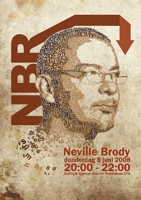
Neville Brody

I continued to look at other designers work on posters whilst I was developing my work. I love Neville Brody's work I've looked at his before and I wanted to refer to his posters as they include both images and typography. I've been looking at the way he has set out the layouts and the relationship between type and image. Here are a few examples which I been looking at...


Poster DEVELOPMENT...100 years of GF Smith paper

I began this process by choosing my favourite images that I think were appropriate for my poster design. I used Adobe Photoshop and Illustrator to piece together the formats of my initial layout design which I did in my sketchbook. I have purposely chosen to use a simple font, 'Didot'. I made this decision from researching the company and its past poster designs. I have also used my photography from my final piece from task1 as I believe it was the most successful out of all of my development.


POSTERS....thinking about grids and layout

I want my poster look professional and I want to make sure that my image and typography go hand in hand. I've been briefly looking at different poster layout but mot by any particular designer.  From looking at many different designs in books on the internet and even on the street I personally like it when the Text follows the path of the images. For example below where the word 'hollywood' follows the outline of the mans jacket in the image. When you see posters like this I think it draws the eye of the viewer to actually consider what the information is tell us rather than glancing at the it. Here are a few other examples which I like.


POSTER... Yulia Brodskaya

I have been thinking long and heard about my poster for task two add I think that the typographical element is just as important if not more than the imagery. I've been looking at Yulia Brodskaya and her work with paper for inspiration and ideas of how to tackle my typography for the poster. She uses a technique of curling the paper into the letter form and It looks pretty awesome. You'd think it would be hard to make out what it was spelling however it ticks all the boxes and communicate visually well. Here is some of her work which I have looked at for inspiration. Personally I prefer the all white piece, I love how simple yet effective it is!


Sunday, 13 March 2011

More Development...

 I looked at flowers in task1 so with the left over piece I returned to looking at the structure of flowers. I continued to use the 'left over' pieces and this is what i came up with... I was just going to throw away these piece, but luckily I didn't.


No more WASTE...

So I had started to look at how I can use the 'left over' pieces of paper could be used efficiently and not just thrown away. Strangely enough I had actually kept all of the off cuts from my 3d final structure for task one! There was so much paper simply going to waste...


I experimented photographically ways of using my paper cut offs and below you can see my outcomes. Some weren't as successful as I'd hoped but it was surprisingly hard to capture the paper fall through the air. I was very pleased with some of the results, I think they look ace.


Waste not, want not

So when I was looking in to company GF Smith I found that it was keen on being seen as an environmentally friendly company and this got me thinking. All of these models which i have been making all have 'cut offs' and left over pieces just going to waste! However luckily I had saved some, so I began to experiment with these.


ENVIRONMENT...GF Smith Paper

I have continually been looking at the company GF Smith and I found that they now offer a wide range of papers which have environmental accreditation. So they do care about the environment, which is something of great importance nowadays. But what I'm thinking is how can I show this within my poster?

http://www.gfsmith.com/paper/environment

Researching celebration...CONFETTI

For secondary research I looked at confetti used in celebrations. I found both colour and black and white images and I actually like them both, I didn't think the sense of the celebration would be as obvious in black and white but I was proven wrong.
Confetti is used at parties and weddings...any occasion of celebration.


Saturday, 12 March 2011

DOT DOT DOT ...

From my research I was inspired to go down a different route and rather than work with my previous 3d piece, I decided to experiment with paper dots made using a hole punch. Then in the brief it says that GF Smith are CELEBRATING, so I wanted to be inventive and show ways of celebrating the multitudes of uses of paper.
When I think of celebrations I automatically paint a picture of a party, it's a way of rejoicing. Below I wanted to visually show and represent the word 'celebrate'. I began by sprinkling the paper dots in front of the camera as I was taking the photographs. I realised afterwards whilst looking back at my photography that it almost reminds me of confetti.


I also looked at how I could use the hole punched pieces to overcome the typographical element for the poster. I manipulated the pieces into both '100' and 'GF' as you can see in the photographs below. 


PATIENTS is a vertue

I remember seeing a piece of work back home in Manchester on display in an exhibition which somehow ties in with this project. I couldn't remember the artists name however through the wonders of the internet i was able to find this information out. Nikki Douthwaite is an artist who creates her work using 550,000 paper dots?! Basically she uses the hole punched paper, the bit that we never tend to use and simply goes to waste. It sounds crazy and massively time consuming however I saw this work over two years ago and I still remember it so I suppose it all seems worth it in the end. Here's some of her pieces of work, I totally admire her patients...